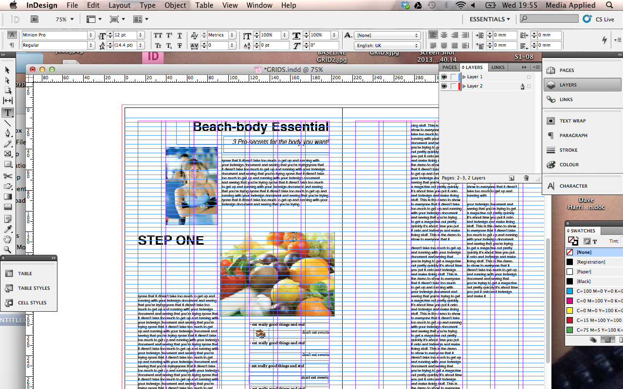
Using grids when designing can be a massive help when trying to establish some coherence to the page and an identifiable structure. Once the foundations are established then anything that breaks the structure will stand out more and have more of an impact. Here’s a very simple look at the use of a 3 column grid but a good exercise is placing tracing paper over a magazine page and trying to figure out what grid they are using – 3 columns, 6? 7? 9? Then look at how this columns have informed the layout.
Here’s some advice on how to set up grids for InDesign, Photoshop and Microsoft Publisher.
